UX/UI Designer
5 Months
Solo Project
Moving into a new environment is always stressful, especially for college students. Overwhelmed with the stress from classes, relationships, financial stability, and life. We often ignore the importance of a proper diet and balanced nutrition. Over time this severely damages our health and productivity.
I want to identify the fundamental issue of what causes students to have unbalanced nutrient intake and understand students' expectations on accessing food resources.
Furthermore, I want to develop a solution to help students understand better about their bodies and get into a habit of a healthy lifestyle.
Track your eats, track your health
Effortlessly log your meals, calories, and nutritional intake with daily food diary.
Shop smarter, save more
Unlock savings on groceries with exclusive coupons tailored just for you.
Log your meal any time, any moment
Use the build- in camera feature to identify your meal quickly.
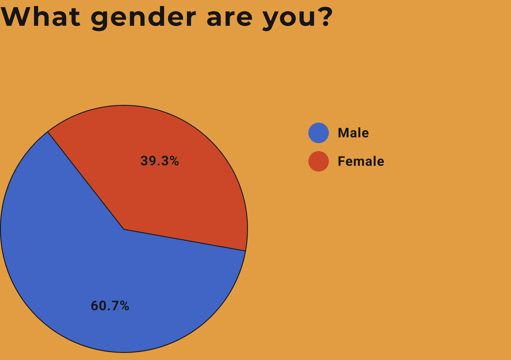
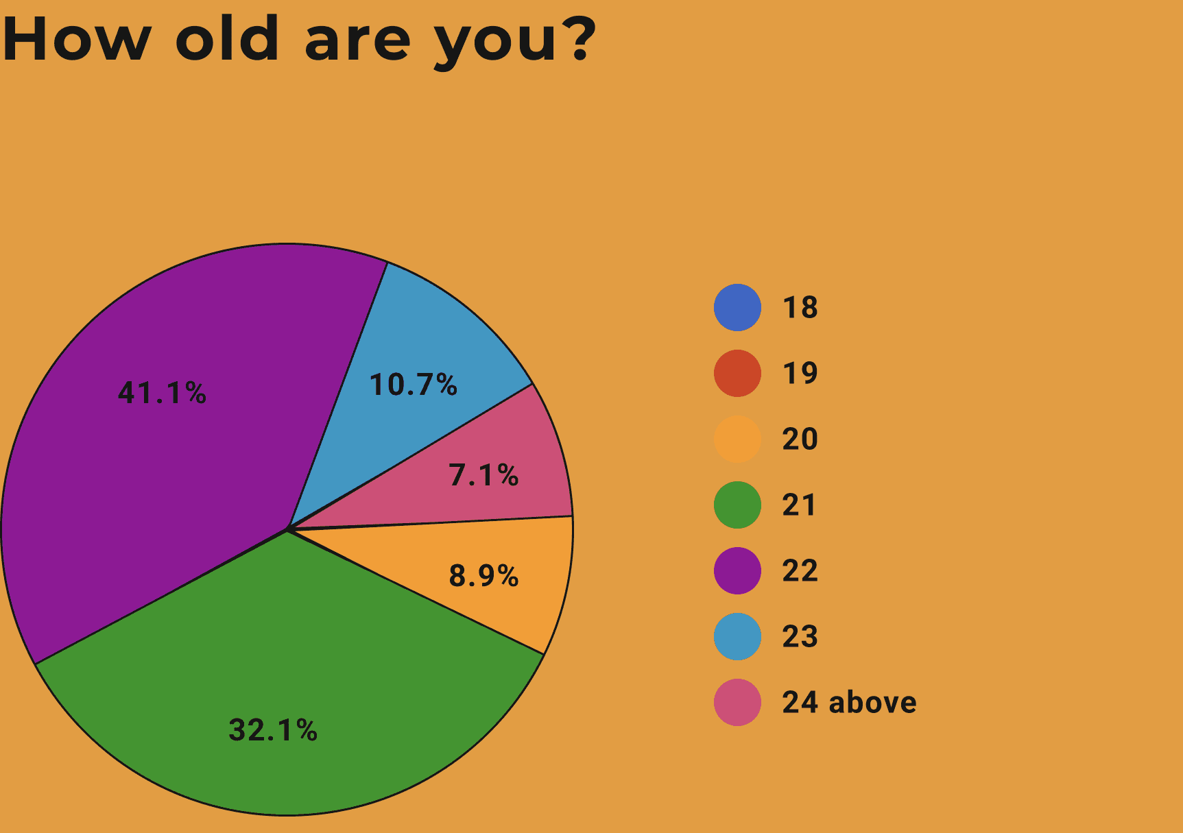
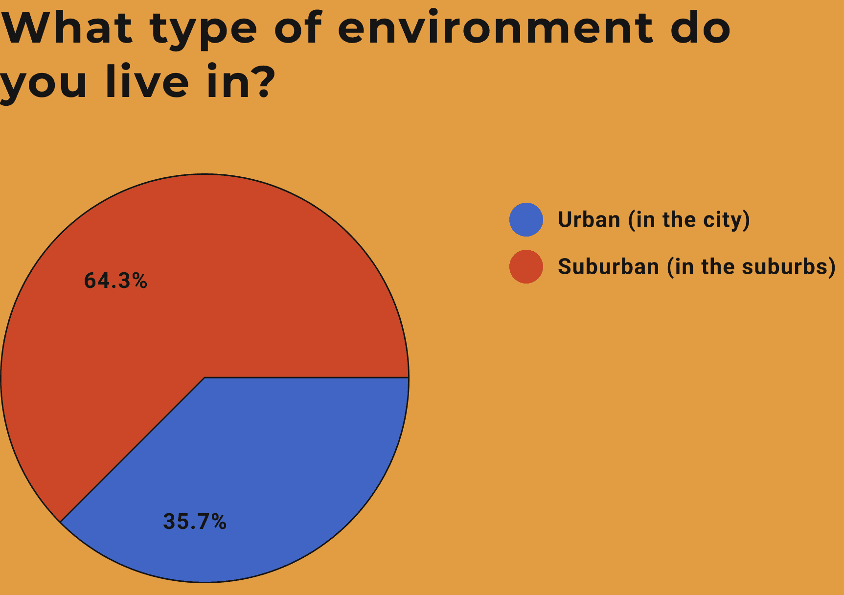
I conducted an online survey through Google Forms to help me understand student lifestyles and eating habits. I was able to gather information from 56 participants.
Here are the results of my survey:
I interviewed five participants from my previous survey on their experience with existing nutrition apps in the market.
Trying to understand my target audience's experiences with nutrition apps and obtain in-depth qualitative responses regarding opinions on diet and proper nutrition.
Some sample questions are:
1. What are the difficulties you encounter when it comes to diet?
2. What are some inconveniences when you are using diet or nutrition apps?
3. What is your most ideal route for tracking your meals or body status?
@fizz
I felt discouraged by the complicated UI design, and it really frustrated me whenever I saw some apps with overly complex outlines. It just made me doubt if I can even use the app properly.

@fizz
I hate searching for nutritional facts on every meal I eat; therefore, I am looking for an app that has a straightforward information layout on food items.
@fizz
I want an app that provides more accurate and precise calculations on body status, like full transparency on how much I need to eat in order to achieve my goal.

@fizz
I am a broke college student, so I spent a lot of time working outside of school; therefore, spending time and money on groceries is harder for me in the long run.

@fizz
Dieting is more challenging for me since I live on campus and have a busy school schedule, so having something to remind me to eat healthy or motivate me would be ideal.
1. WHO reports, "On average, adequate nutrition can raise your productivity levels by 20 percent.”
2. American Psychology Association states that omega-3 fatty acids can reduce depression symptoms.
3. Students with high perceived stress levels show increased poor dietary behaviors such as ready-prepared meal consumption.
4. Suicide is the third leading cause of death for 15 to 24-year- olds. 10.3% of college students seriously considered suicide in the past 12 months.
After all the research and investigation of our users, I discovered many products in this niche offering similar features but not the solution for my target audience. This got me thinking about what I could implement in order to help solve the pain points for my users.
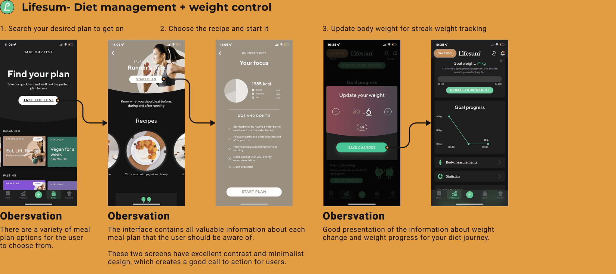
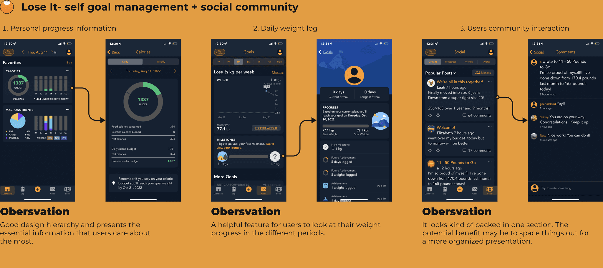
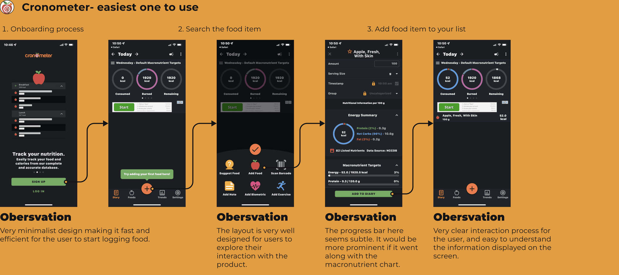
Here is the products list that I analyzed for multiple diet-tracking apps, along with a qualitative assessment with each of their most prominent features:
I reviewed all the keynotes and recordings from my previous interview session. Then I wrote down what each interviewee said, their emotions, actions they took, what they saw, their pain points, and desires related to the problem space.
Here are some of the key points:
- Participants often have a more challenging time getting proper access to nutrition knowledge.
- Participants dislike products with confusing menu structures.
- Participants prefer products with good functionality and good CTA to help them navigate the product.
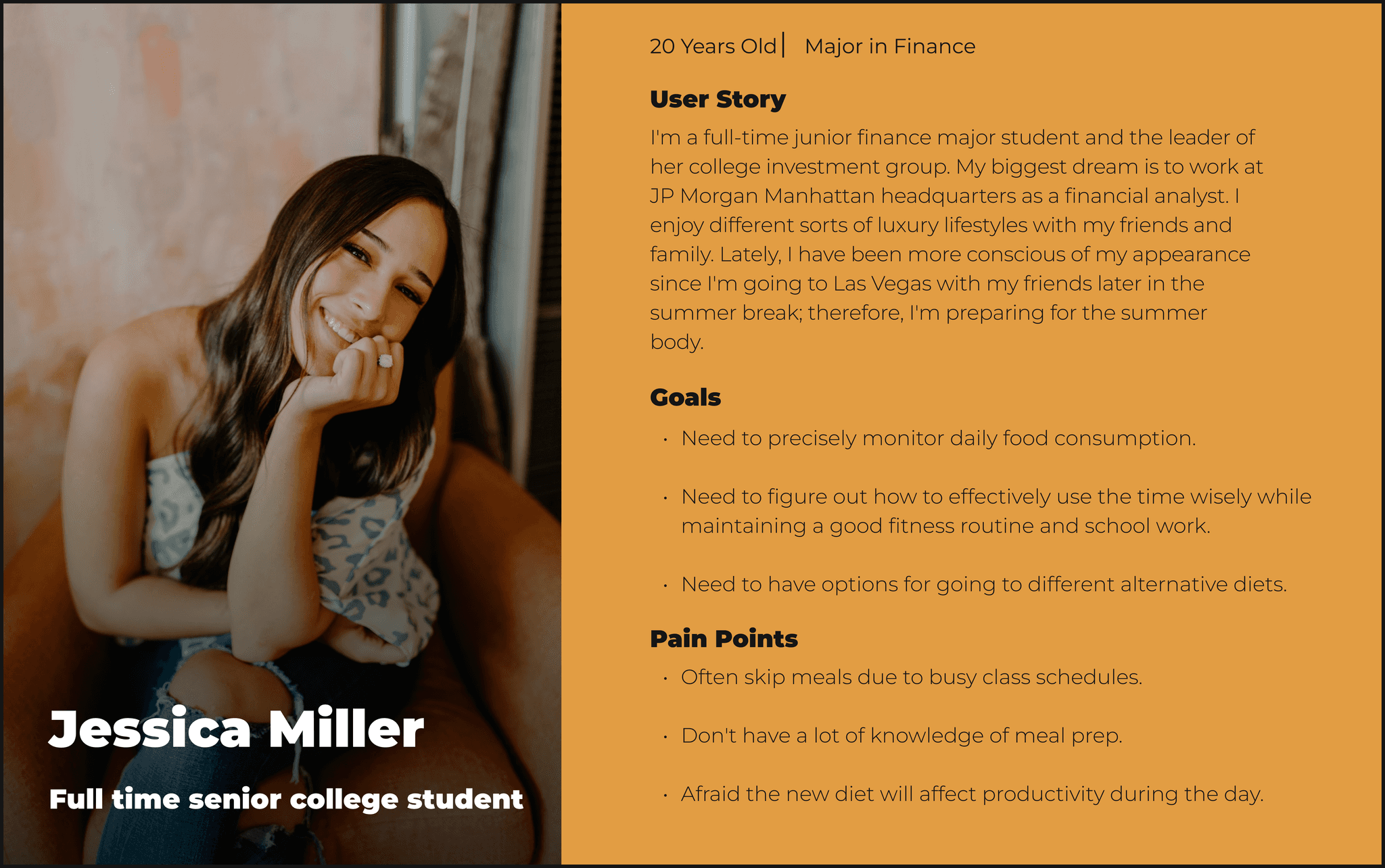
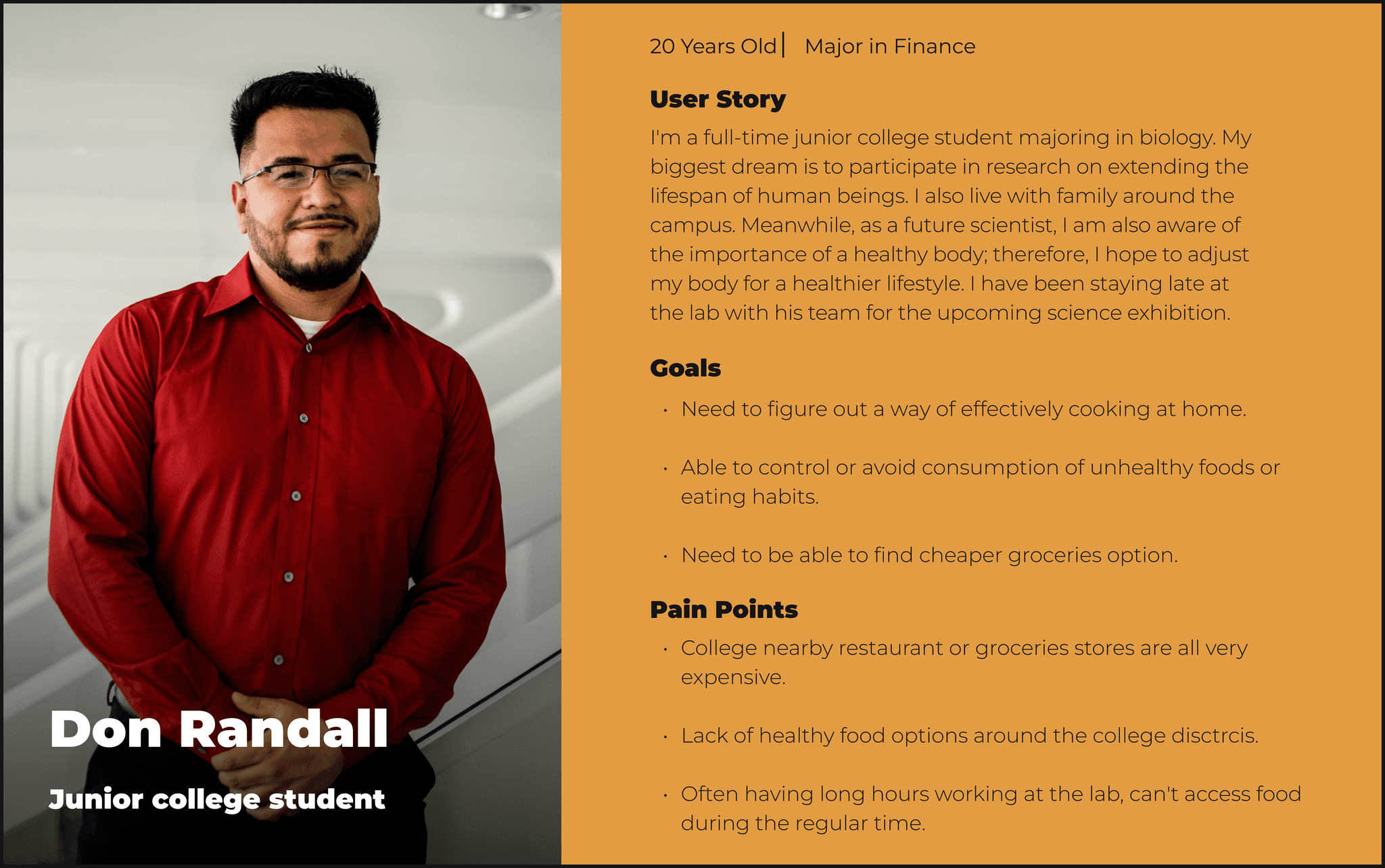
Creating personas helps me as a designer better understand “who I am designing this product for?”
I established three personas to gain a deeper insight into the user's requirements and objectives. Based on my prior research, I singled out this persona since the product caters to a rather niche target audience.
Once I had a comprehensive grasp of my users, I crafted user stories to pinpoint the functional requirements of my product. What's crucial is that I then prioritized these user stories and established the Minimum Viable Products (MVPs).
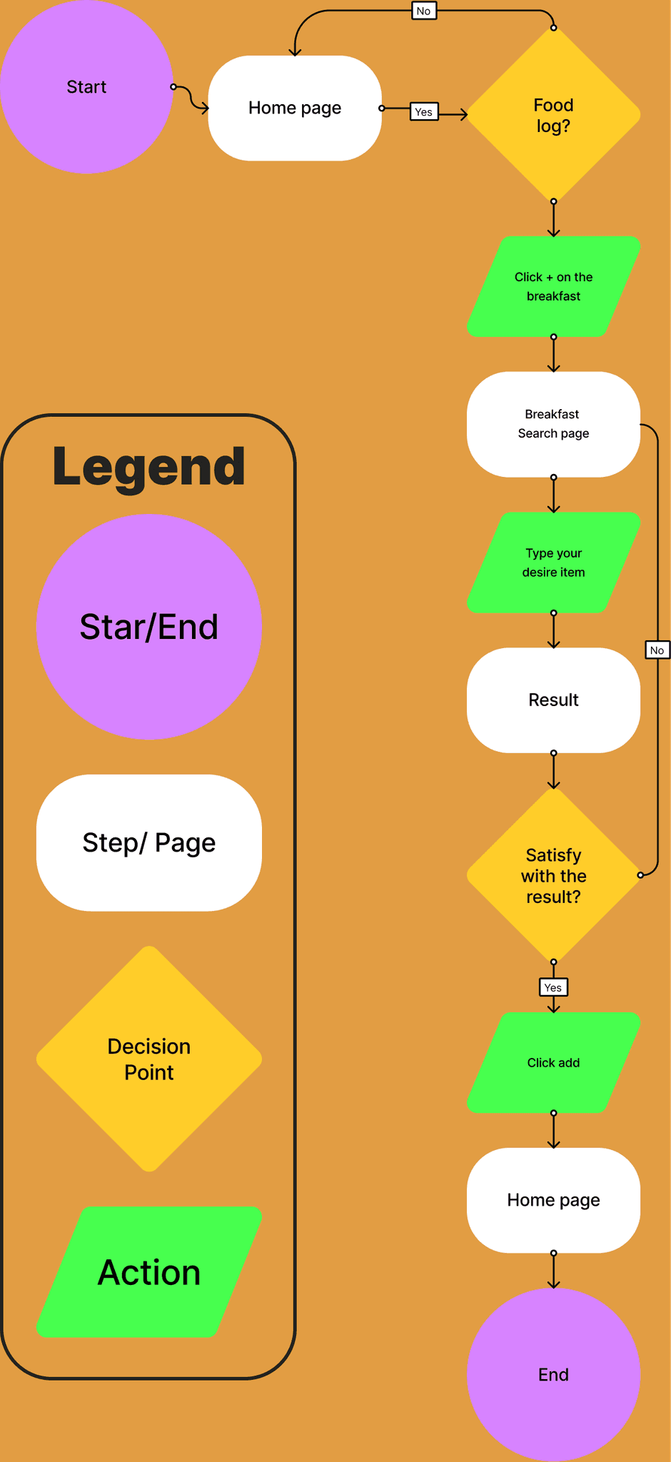
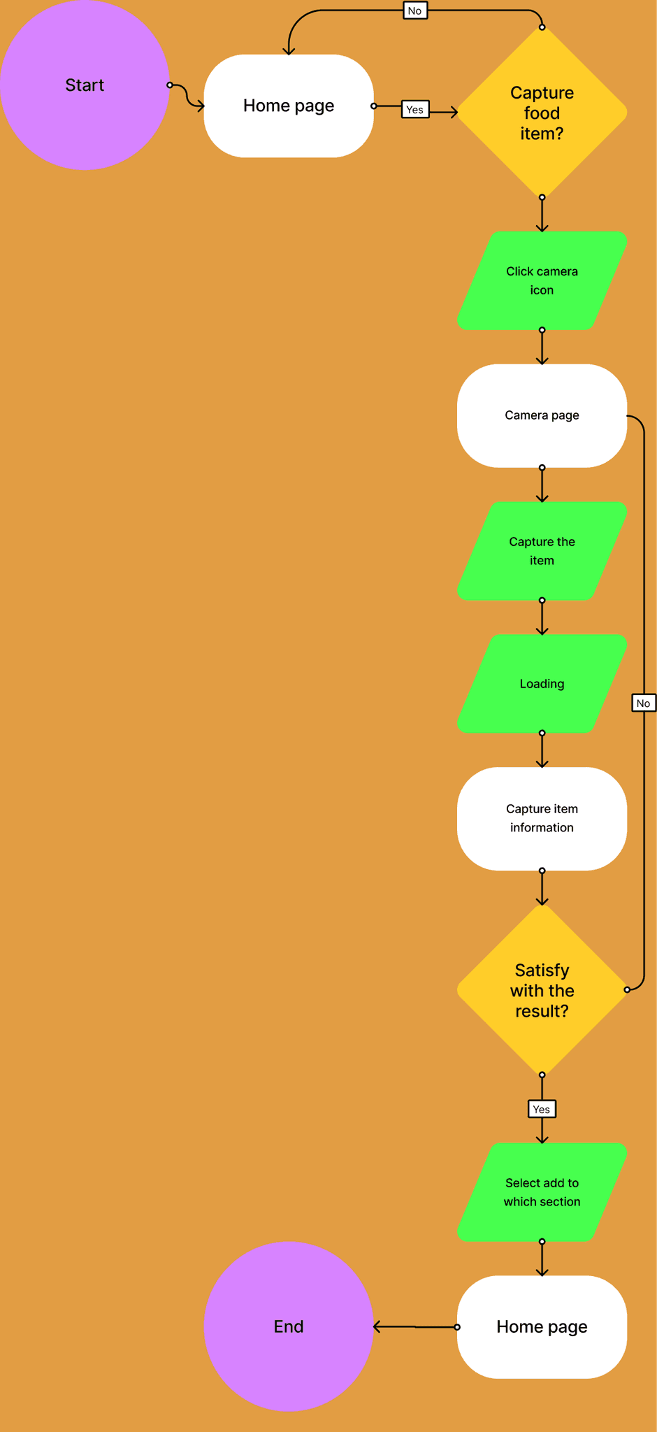
Out of these MVPs, I selected three red routes integral to my design. I devised distinct user flows for each red route to observe how users navigate and successfully reach their goals.
Flow 1: Add new food items to the food diary
Flow 2: Logging food items with the camera
Flow 3: Explore coupons deal

Following the creation of app sketches, I conducted guerilla usability testing with five users to promptly identify areas for improvement. I then incorporated user feedback to iterate on the design. The subsequent section outlines the key modifications I implemented as I transformed my wireframes based on the feedback I received.
Lack of visual hierarchy
When I asked my participants to describe what they saw at first on the home page, they were immediately confused about where to look.
Inconsistent UI placement
Participants mentioned the odd placement of the calories next to the add button when most of the information was layout on the top right side of the page.
When I completed and evolved my wireframes into high-fidelity mockups, I conducted two rounds of usability testing and gained some insightful feedback from my ten users. Here are some of the major changes I implemented based on those feedbacks:
Home page reorganization
Participants were confused upon reaching the home page, so here is what I improved:
- Decrease spaces between each element so the user can easily see the plus icon for a more explicit call to action.
- Expand the calendar to make it seem more like a scrollable section.
- Change the home page icon from calendar to home due to confusion during navigation.
No feedback after adding a food item.
Participants pointed out there weren't any responses on whether users completed the tasks; therefore, I added a push notification whenever a user successfully added a food item.
Coupon card take up too much screen space
One feedback I constantly receive is to reduce the card size on the coupon page. Reducing the card size will be beneficial for users to view more content on a page.
Keep learning
Conducting the usability tests with strangers was also a new but frightening experience for me. I shuttered when speaking and introducing myself to the participants, but I improved progressively with repetition. This taught me more about focusing my attention on the process instead of being fixated on a perfect outcome.
Embrace ambiguity
One valuable thing I’ve learned during this process is to take your time when making important decisions. It is common for us to make rash and irrational decisions when we’re in an uncomfortable situation. I found it helpful to step away from my desk and allow the information to compartmentalize in my head through more relaxing activities. Often, these are where my most creative ideas stem from during the early stages of this case study.
Afterthought
In the future, I plan to enhance my project by implementing a streak system, encouraging users to log their meals and weight daily. This approach promotes consistency and motivates users to stay active and mindful of their health. I also see potential collaborations with grocery stores like Amazon Go, as technology advancements are reshaping our grocery shopping habits toward fully automated systems. This opens exciting opportunities for my product, including the possibility of rewarding users with coupons or discounts for maintaining streaks.
